The Ultimate Guide to Using Images within Divi
The Big Picture
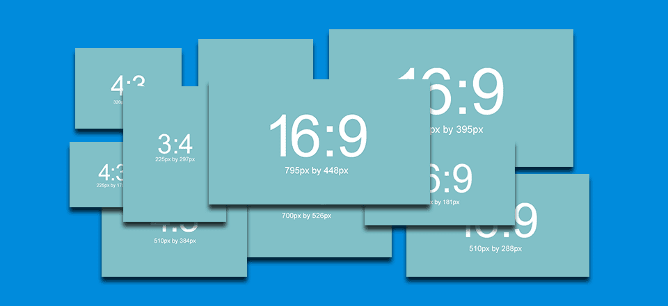
Finding the perfect image sizes for your Divi website depends on three main factors:
- aspect ratio: the height and width of your image.
- column layout: the maximum width of your image.
- responsiveness: the changes made to the dimensions of your image on different screen sizes.
In the sections below I’ll show in detail how an understanding of these three factors can be used throughout Divi, resulting in perfect image sizes for any use case.
Divi Image Optimization Guidelines
Use Divi’s Image Aspect Ratio (16:9, 4:3, 3:4)
Aspect ratio expresses the proportional dimensions of the width and height of an image or screen. The number on the left of the colon represents the width (x axis) and the number on the right of the colon is the height (y axis). The two most popular aspect ratios are 4:3 and 16:9. These should look familiar to you if ever adjusted your TV screen or monitor settings before. The 4:3 aspect ration is the standard screen size for older TV’s and monitors and has a more box-like display. The newer high definition televisions and monitors today have the 16:9 aspect ratio which has a wider display. The 3:4 aspect ratio is useful in Divi for displaying portraits.
Divi was built with three aspect ratios in mind – 16:9, 4:3, and 3:4. For this post, I will be basing all recommended image dimensions on these aspect ratios. If you haven’t already done so, you can check out Divi’s image templates to see the standard sizes and aspect ratios recommended for your images.
Note: There are useful aspect ratio calculators out there that may help you find the right image dimensions as well.
Optimize Images Before You Upload
It is always best to optimize (resize, compress, crop, etc…) your images before uploading them to WordPress. Also try your best to keep all of your image file sizes between 60kb and 200kb. That way you aren’t slowing your page load time down too much. For a complete guide on how to optimize your images, go here.
Don’t Forget SEO
When it comes to reading images, search engines rely on the image’s filename, ‘alt’ text, captions, file type, file size, etc… This info is placed in the img tag which displays your image. Make sure you are adding this info to your images whenever uploading a new image to your media gallery.
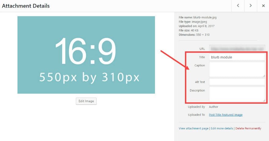
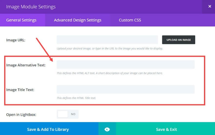
Additionally, the Divi Builder allows you to add ‘alt’ text and title text from within certain modules. Keep an eye out for these when using certain Divi Modules.
From what I have researched, Google doesn’t read background images automatically since they are not wrapped in an img tag. Background images are displayed using CSS and are mostly used purely for design purposes.
File Formats
In general, most images on the web are either in JPEG, PNG, of GIF format. JPEG’s are good for most situations because of its compatibility, use of color, and small file size.
JPEG’s should be used for all of your full color photographs like featured images and background images.
PNG is also a very compatibile format for the web. PNG’s are great for smaller images with a lot of detail. The PNG format also supports transparent background capability which is perfect for logos and graphical elements.
GIF’s are good for small images with limited color. GIF’s are unique because they can be animated, which is sometimes useful.
Image Dimension Guidelines Based on Divi’s Column Layouts
The following guidelines for image dimensions are based on Divi’s default layout settings. This includs a content width of 1080px and a gutter width of 3. Changing these settings may require you to adjust the dimensions of your images slightly.
The general rule of thumb is to have your images be at least as wide as the column in which it sits. Here are the dimensions you need to have for your image according to each column layout.
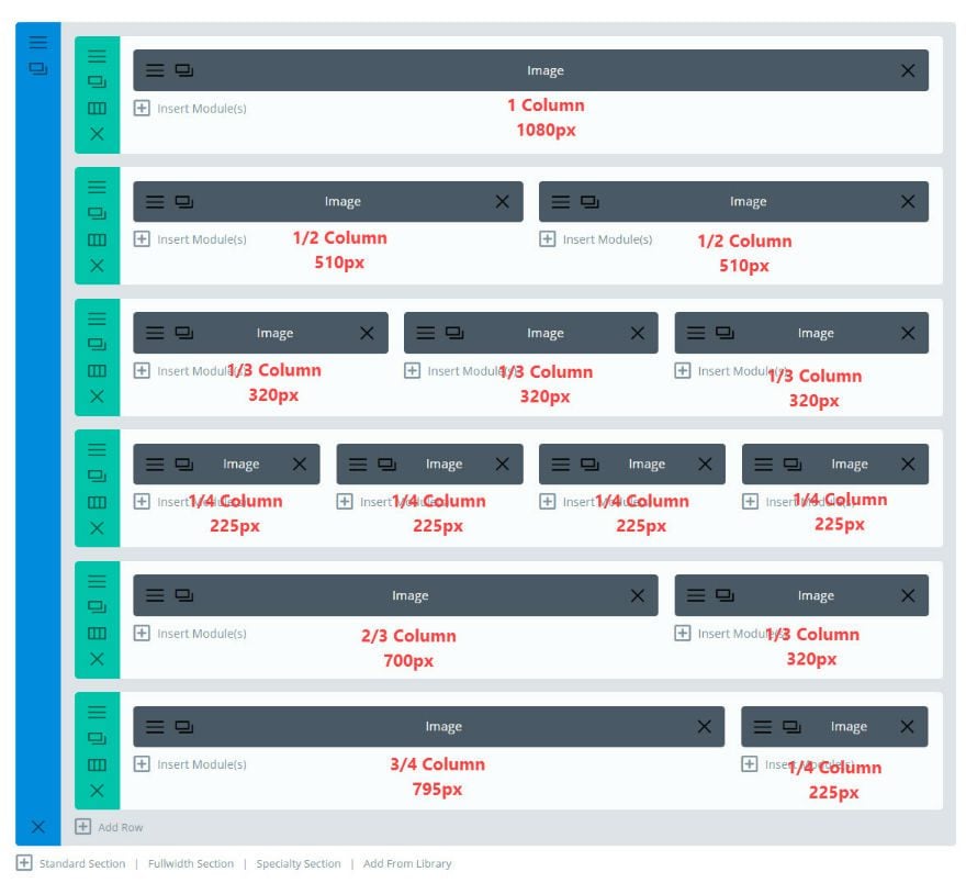
This doesn’t address the height your images need to be. So, here is a list of dimensions according to the 4:3 and 16:9 aspect ratios. This is helpful to keep your images at a width and height that scales appropriately for mobile.
The following image dimensions follow the 16:9 aspect ratio standard
1 column: 1080 x 608
¾ column: 795 x 447
⅔ column: 700 x 394
½ column: 510 x 287
⅓ column: 320 x 181
¼ column: 225 x 128
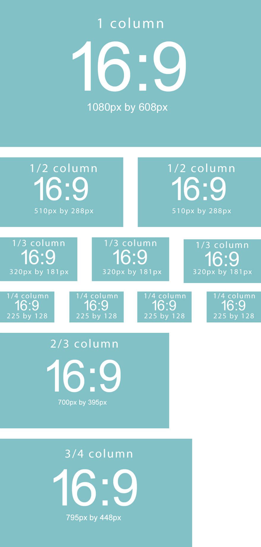
The following image dimensions follow the 4:3 aspect ratio standard
1 column: 1080 x 810
¾ column: 795 x 597
⅔ column: 700 x 526
½ column: 510 x 384
⅓ column: 320 x 241
¼ column: 225 x 170
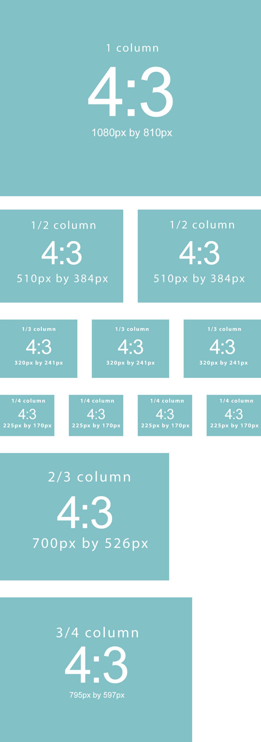
Image Dimensions for Different Divi Modules
Image Module
When using the image module, you can simply follow the 16:9 and 4:3 layout to choose what image size you need for each column layout.
For example, if you are using a 4 column layout with a 4:3 aspect ratio, you would insert an image that is 225px by 170px for each column.
The upside to using the specific sizes for each column is that it gives you the exact image size you need without wasting image file size which may slow down your page load time.
The downside is that it doesn’t fill the column width on smaller screens like tablets. When the screen size drops below the 1080px breakpoint, the 4 column layout changes to a 2 column layout. This 2 column layout has room for an image size with a width of 370px. So if you want the image to fill the column width on tablet displays, you may want to start with an image size with a width of 370px instead of the 225px width.
Here is what a 4 column layout with 225px by 170px images looks like on a 2 column tablet display:
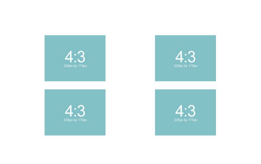
That looks pretty good, but if you started with an image that was 370px wide you would get an image that fills the column width on the 2 column tablet display like this:
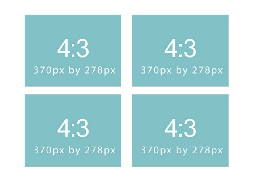
So if you are looking to have your images fill the maximum width of the column on all devices, I recommend the following sizes for each column layout when using the image module.
For 4:3 aspect ratio:
1 column: 1080 x 810
⅔ column: 770 x 578
¾ column: 770 x 578
½ column: 770 x 578
⅓ column: 770 x 578
¼ column: 370 x 278
For 16:9 aspect ratio:
1 column: 1080 x 608
⅔ column: 770 x 433
¾ column: 770 x 433
½ column: 770 x 433
⅓ column: 770 x 433
¼ column: 370 x 208
Slider and Post Slider Background Images
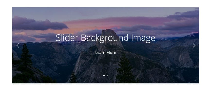
Slider background images should be at least the width of the column that it sits in. So deciding on an image size is pretty straight forward. Just use the guideline for image sizes for each column width.
The height of your slider background image will be determined by the content of the slider, so you may need to adjust the height of your background image.
The following image dimensions follow the 16:9 aspect ratio standard:
1 column: 1080 x 608
¾ column: 795 x 447
⅔ column: 700 x 394
½ column: 510 x 287
⅓ column: 320 x 181
¼ column: 225 x 128
The following image dimensions follow the 4:3 aspect ratio standard:
1 column: 1080 x 810
¾ column: 795 x 597
⅔ column: 700 x 526
½ column: 510 x 384
⅓ column: 320 x 241
¼ column: 225 x 170
And if you want the slider to span the width of columns on mobile devices use these guidelines:
For 4:3 aspect ratio:
1 column: 1080 x 810
⅔ column: 770 x 578
¾ column: 770 x 578
½ column: 770 x 578
⅓ column: 770 x 578
¼ column: 370 x 278
For 16:9 aspect ratio:
1 column: 1080 x 608
⅔ column: 770 x 433
¾ column: 770 x 433
½ column: 770 x 433
⅓ column: 770 x 433
¼ column: 370 x 208
Fullwidth Slider Background Images
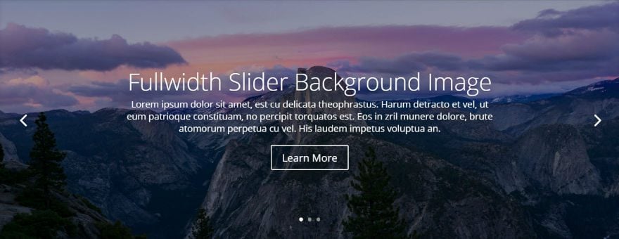
Recommended minimum width: 1920px
The width of your fullwidth slider background image is always determined by the browser width. Based on standard screen sizes we recommend that your images are at least 1280px wide. But for larger monitors, a safer bet would be to use an image that is 1920px wide.
Again, with sliders, the height is always determined by the amount of content, so you may need to adjust the height to fit your needs.
Slider and Post Slider Featured Image
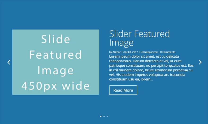
Slide featured images will only appear in sliders that are in ⅔ column, ¾ column, or 1 column widths. We recommend that your slide images are at least this wide in order to adjust for desktop and mobile devices.
1 column: 450
¾ column: 330
⅔ column: 320
Note: A browser width that is less than 768px will hide the image and just show the post excerpt.
Images in Lightbox Displays
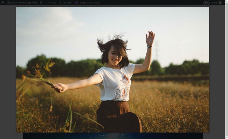
If you are using the lightbox feature with your image, you may want to use a larger image. Usually 1500 x 844 works well for a good full screen image in lightbox display for large monitors.
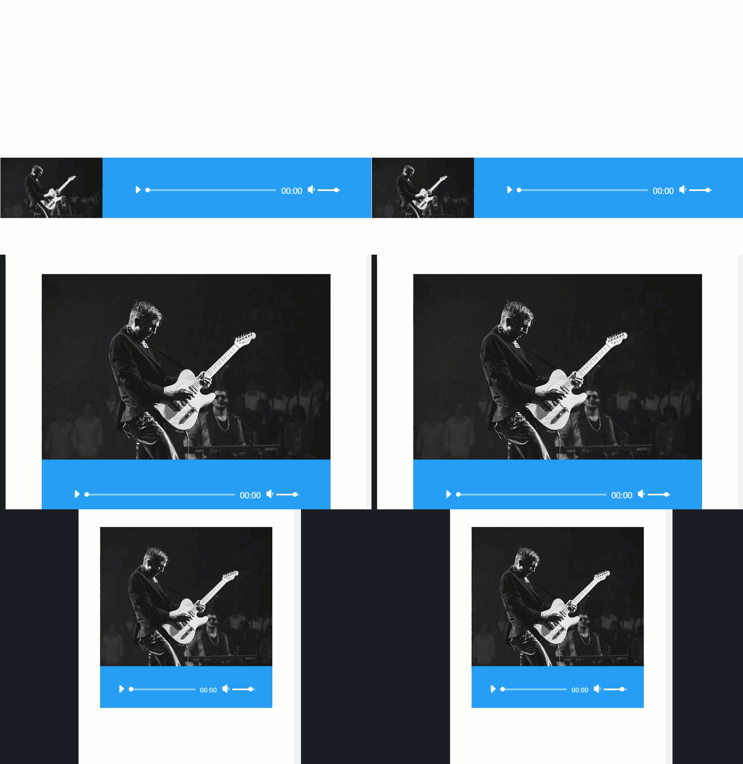
Audio Module Cover Art Image
Width: at least 780px
Even though the image starts out small (230 x 130), it spans the full width of the content section on screen sizes less than 780px.
Blog Module Featured Images with Fullwidth Layout
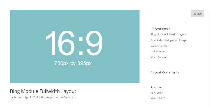
Image width: equal to the size of its column width
Adding featured images to your posts to be displayed using the Blog Module is pretty straightforward. The featured images should be as wide as the column it sits in. For example, if you are using a blog module in a two-thirds column with a right sidebar, you would need to use a featured image at least 700px width since that is the width of a two-thirds column in Divi.
Don’t forget that the featured image will also be used on your single post template (the page that displays your full post after you click on the post excerpt). So, make sure your singe page template is also using a two-thirds column to display your featured image.
1 column: 1080
¾ column: 795
⅔ column: 700
½ column: 510
⅓ column: 320
¼ column: 225
Blog Module Featured Images with Grid Layout
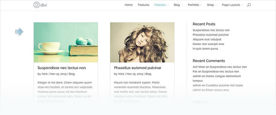
Width: Equal to the size of the single post column width (default 795px)
And, just like with the Blog Module Fullwidth layout, the featured image needs to be large for your single post display. What is great about the Blog Grid layout is that Divi uses a smaller version of the featured image uploaded to the media gallery (with a width of 400px). Since this smaller image is created and displayed automatically, there is no need to worry about your page loading an image file size that is too big for the grid column.
Porfolio Module Featured Images (Fullwidth and Grid Layout; Standard and Filterable)
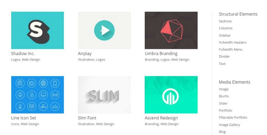
Width: equal to your single post column width (default: 795px)
When you click to view your portfolio item from the grid layout, the featured image will span the width of the content section. Just like for the Blog Module,
Just like for the Blog Module, Divi creates a smaller version (400px wide) of the portfolio featured image to be used for the Portfolio Module grid layout. This is helpful for reducing file size and keeping your page load time down. So, when creating a new portfolio item, it is important that your featured image be at least as wide as the column of your single portfolio post template.
Blurb Module Image
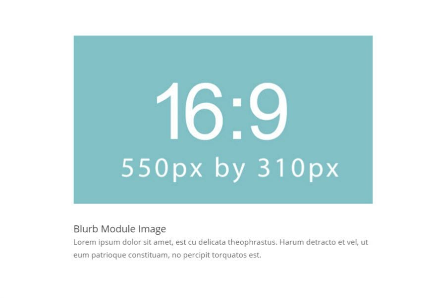
Maximum width: 550px
The blurb image follows the same rule of matching image width with column width, with the exception of the 1 column, which has a max width of 550px instead of the normal 1080px. Therefore, a safe bet would be to insert images with a max width of 550px. Here are the image widths for the Blurb Module in each column layout.
1 column: 550px
½ column: 510px
⅓ column: 320px
¼ column: 225px
Gallery Module Images (Slider and Grid Layout)
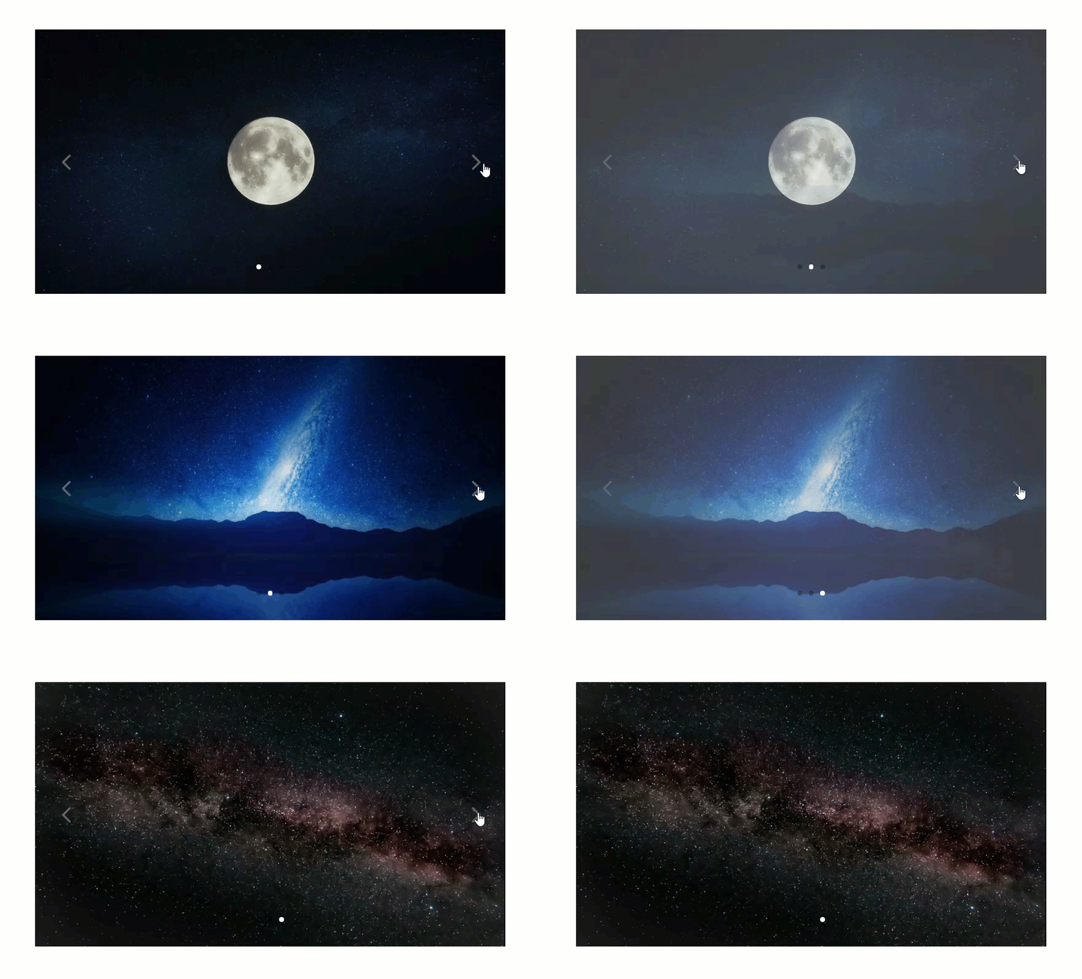

Recommended dimensions: 1500 x 844
Since the gallery module images open in a lightbox display, I recommend using an image that is big enough to fill the browser window when viewing the image in lightbox (somewhere around 1500px wide for large monitors).
For the grid layout, Divi creates a smaller version (400px wide) of the gallery. So, the large image file size reserved for lightbox won’t be displayed on the gallery grid. This is helpful for reducing file size and keeping your page load time down.
For the slider display, it is important to try and keep all of your images the same width and height since the height of the images will change as you go through the slides.
Person Module Image
Recommended Dimensions
Width: 600px
For the person module, it’s time to introduce the aspect ratio 3:4 which is a great size for portraits. Here are the recommended person module image sizes for each aspect ratio:
3:4 – 600 x 800 (recommended for portraits)
16:9 – 600 x 338
4:3 – 600 x 400
Responsive Functionality
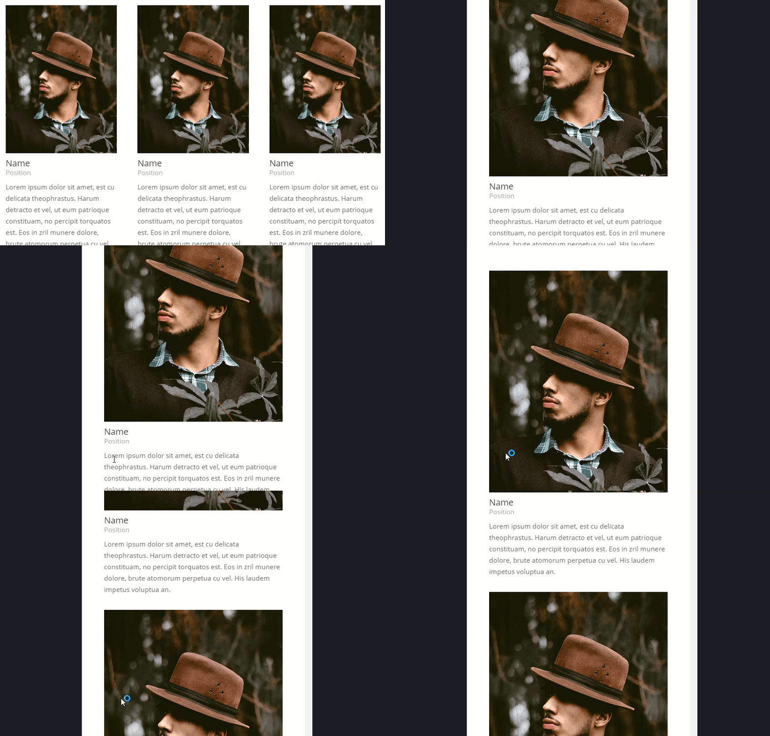
A person module image on a 1 column layout will be displayed on the left side of the content at 320px.
When the screen size is less than 767px the image spans the width of the content area at a max width of 600px.
The following gif shows the person module using a 600 x 800 image (using the 3:4 aspect ratio) on different screen sizes.
Post Title Module Featured Image
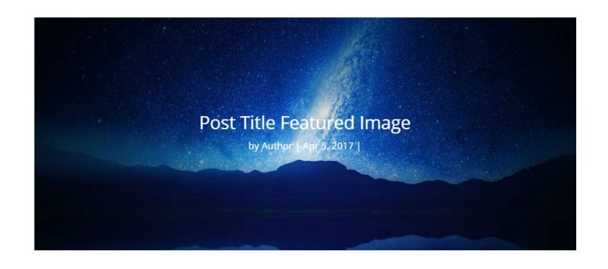
Width: equal to the column width
The Post Title Module displays the title of your current post, and optionally the post Featured Image. You can choose the placement of your featured image to be above the title, below the title, or as a background of the title. Whatever your selection, the image will still span the width of the content section. So if you are using a 1 column layout for your Post Title Module, 1080px width is ideal for your featured image.
Shop Module Product Images
Recommendations
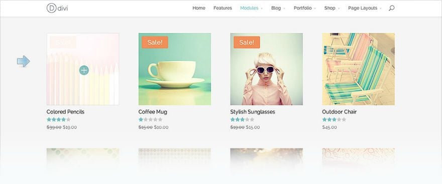
Recommended width: 330px
Recommended number of columns: 3 or more
The shop module allows you to display your products in a one column layout all the way up to a six column layout. Here are the widths of the product images when displayed on each column layout:
6 column: 150px
5 column: 183px
4 column: 240px
3 column: 332px
2 column: 520px
1 column: 1080px
Functionality
Divi generates a smaller version of the product image (with a max width of 400px) because the Shop Module was really built to show products on ⅓ column or smaller. This means that your 2 column and 1 column layout may show a blurry version of your product image.
Also, once you click on a product in the shop module, the single product page displays your product image at 300px.
To accommodate for a 3 column layout and the single product page, I recommend sticking with a product image size at least 330px wide.
Testimonial Portrait Images
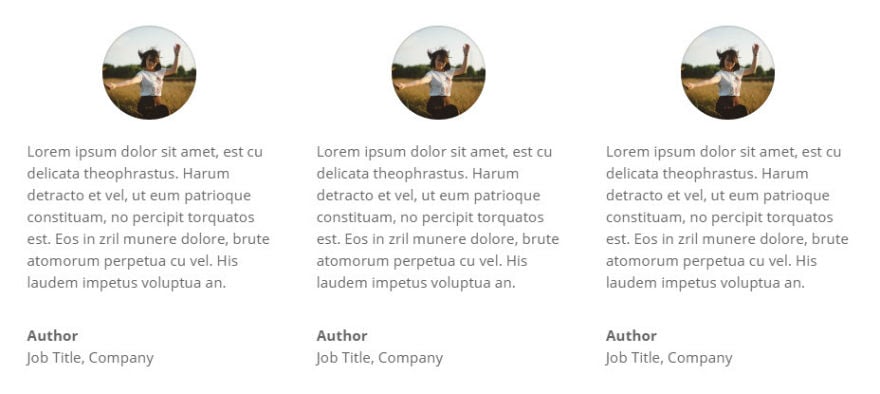
Image size based on module settings
By default, Divi converts your portrait image to a 90 x 90 size and a 90 border width displaying it as a circle. So if you are keeping the default settings, I would recommend your image dimensions be exactly 90 x 90. You can get away with having really large images without a 1:1 aspect ratio but this will be a lot of wasted file size that will slow down your page load time.
You can customize the dimensions and border radius of the portrait image from within the Advanced setting of the Testimonial Module.
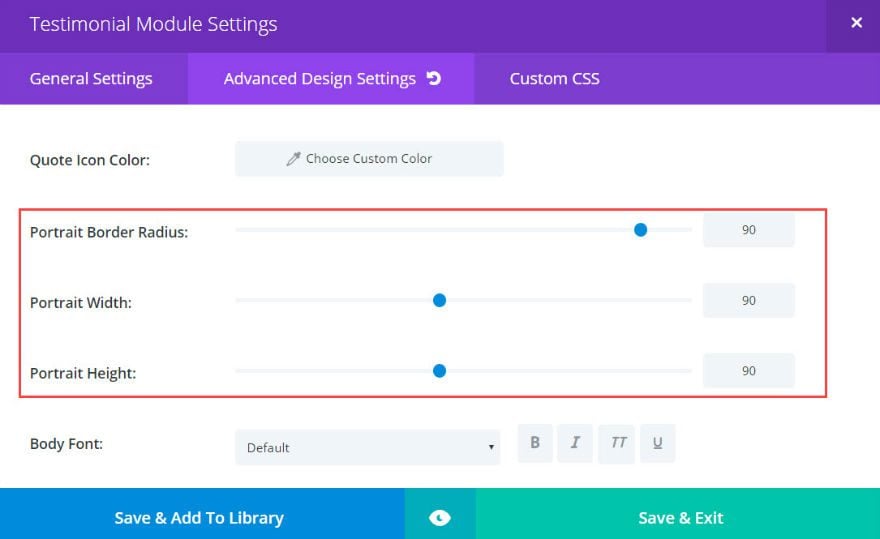
When changing these settings, make sure that you keep the width and height the same and the border radius at 100 if you want to keep the circled images looking good.
General Guidelines for Background Images
When using a background image for your module, the background image will always need to be at least as wide as the column in which it sits. Simply follow the guidelines for Divi’s column widths:
1 column: 1080
¾ column: 795
⅔ column: 700
½ column: 510
⅓ column: 320
¼ column: 225
Here are some modules that need background images to match width of its column:
Portfolio Module
Filterable Portfolio Module
Call to Action Module
Post Slider Module
Post Title Module
Slider Module
Text Module
General Guidelines for Fullwidth Background Images
If using a fullwidth section background image, these images will expand to the full width of your browser. That means you should make these images at least as wide as most larger monitor displays which is around 1920px.
The following modules would require a 1920px width background image:
Fullwidth Header
Fullwidth Portfolio
Fullwidth Slider
Fullwidth Post Title
Fullwidth Post Slider
Fullwidth Image
Also, it is important to note that for all of these modules, the height of the background image is determined by the amount of content within the module so you may need to adjust the height of your images as needed.
Fullwidth Header Module
Fullscreen Background Images
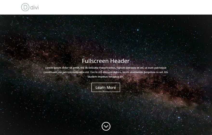
Not to be confused with fullwidth background images, the fullscreen background image refers to the setting on your Fullwidth Header Module that allows your header to span the full size (both width and height) of your browser window.
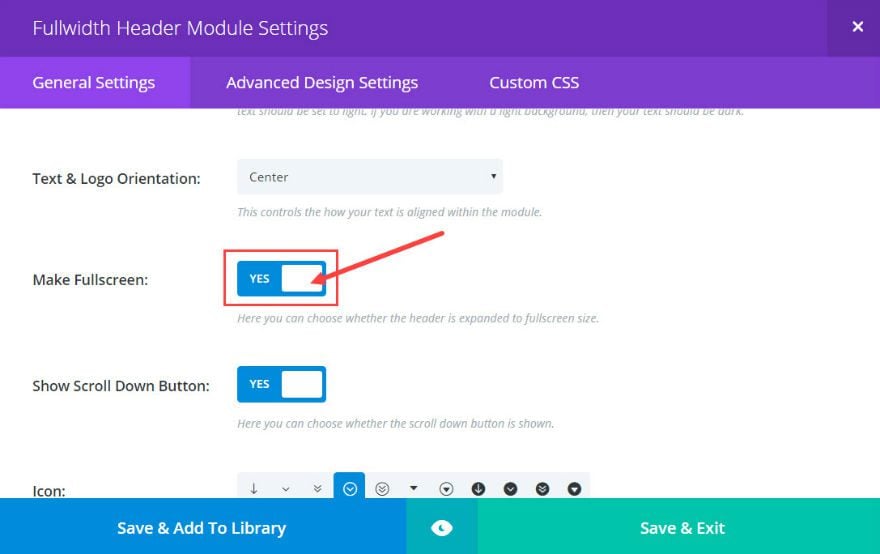
Since most monitors follow the 4:3 and 16:9 aspect ration and will only be 1280px or 1920px wide I recommend the following dimensions for fullscreen background images:
4:3 – 1280 x 960 (recommended for portraits)
16:9 – 1920 x 1080
Fullwidth Header Module Logo Image
The fullwidth header module allows you to place a logo inside the header content area.
There are no standard image sizes for logos. As a general guideline, I would suggest keeping the logo large enough to see clearly on large desktops but small enough to fit smaller devices like smartphones.
Divi’s theme logo is 93 x 43 which gives you a good idea.
Fullwidth Header Image
Recommended dimensions: 510 x 288
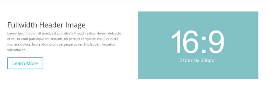
In addition to a logo, the fullwidth header module allows a header image to be displayed in the header content area. By default, the header image will be displayed on the right column of a 2 column layout. Since the image sits in a ½ column, a 510 x 288 image makes the best sense for most situations.
Changing the Text & Logo Orientation option in the Module’s General Settings will allow the header image to be displayed on the left column or centered if you prefer that setup.
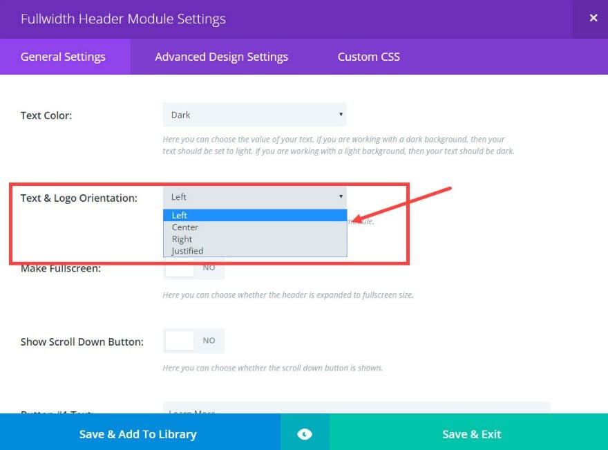
You can also adjust the vertical alignment to bottom, if you want your image to hug the bottom of the header.
Final Thoughts
As I mentioned before, there is no one perfect standard image dimension for all websites and screen sizes. However, understanding the Divi column layout and how each module displays certain images will allow you to create dimensions that work perfectly for your Divi site.
I hope this serves as a helpful resource for your future projects. I look forward to reading your feedback in the comments.
Cheers!

